The Final Year Show

The final year show took place on Thursday 19th and Friday 20th of May. It was a great way for us to showcase the projects that we put so much work into over the last year. We set up our stands to relate to our projects.

I went with an a2 poster as well as printing off my visual diary again and placing it around the wall. I bought various different garden items such as trellises and artificial grass. To relate to the character I purchased tennis balls, dog bones and a red bowl which all appear in the book on page 14.

I was very happy overall with the look of my stand. I have attached some images below.

Placing the Audio Book

I faced some initial difficulty with burning my audio to CD. I tried this around 4 times before I realised it needed to be set up for CD players. After watching some tutorials I then successfully burned onto the discs.

I contacted Reads of Nassau Street to see about getting CD stickers printed. I felt as though putting a regular CD at the back of the book would look less professional. They informed my that this could be done, so I set up my CD document for print and sent them the PDF. Setting up a document for stickers started at €15 which was quite a fair bit to pay for a couple of stickers, but I felt like it would make a huge difference to the look and feel of the book.

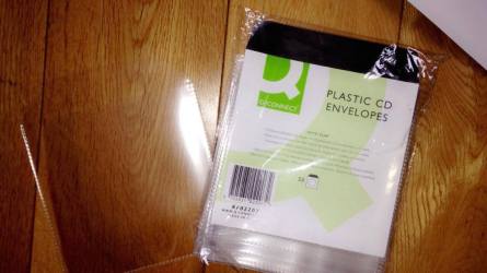
The next step was to find pockets for the CD’s to put at the back of the book. I thought that this would of been an easy thing to do. I went to several different office supply stores and couldn’t find them anywhere. Workers informed me that they are not in demand enough to supply anymore. I looked up numbers for different office supply stores in Dublin and rang around. I eventually got talking to a woman who ran a store in Malahide village who had a pack left in stock. After putting them on hold, I went to collect them and they were exactly what I had in mind. They were perfect. I made some small changes to each envelope for the reader to be able to access the CD as easy as possible. I cut off the flap and made a small cut-out where the finger will be able to remove the CD.

13223420_1000740679980313_914708366_o

The next step was deciding what to stick them in with. I was thinking that glue might be too messy, especially on the paper  back books. I was also concerned that double sided tape would be easy to remove and could perhaps fall out, especially in the hands of a child. I then got in contact with a friend who owns a blinds company to see if they had high quality double-sided tape that I could borrow. They allowed me to use the tape and I was delighted with the outcome.

13224081_1000740759980305_1612531197_o

Arrival of the DPI Books

The books from Digital Printing Ireland arrived today, May 5th. The fast delivery of these books was excellent. I was delighted with the results. They actually gave me 10 books as opposed to the 3 that I had ordered. This was a huge bonus for me.

13224065_10206487086922600_1238225580_o

Gloss Cover and Interior

The laminated gloss books are really striking. I much rather them to the matte finish, which I had originally planned on using! The size is perfect. The 210 x 210mm is such a lovely size for the type of book it is. I am overall very happy with them.

Matte finish and interior

I was slightly let down by the matte finish books. I got the impression from them that they looked to be more like colouring books rather than an actual storybook. This type of book could of been better if I had of got the front cover gloss and left the matte pages inside. Getting the matte cover as well seemed to bring down the book in quality.

Overview

All in all, I am delighted that I ordered the books in two different finishes as the one that I had originally planned on using turned out to be the one that I dislike. I am now looking forward to receiving my Blurb hardback books to see what I think of them.


Audio Book

The last addition of the book which I decided upon, was that of making an accompanying audio CD. I thought that this would be a really nice touch and bring the book to life for the reader.

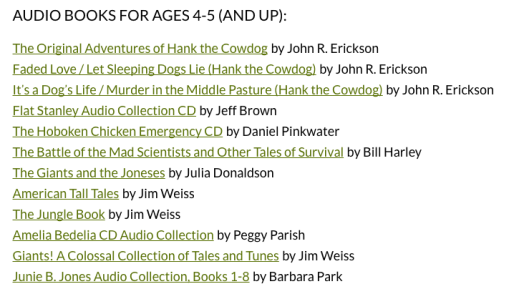
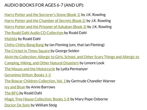
Examples of some excellent audio books for my target audience:

Screen Shot 2016-05-17 at 18.16.07Screen Shot 2016-05-17 at 18.16.15

I began by looking for a reader. I sourced various different audio books both online and in the library and found that majority of the readers were either a man or woman generally of the age of mature age. After testing out 4 different readers, I settled on my chose voice.

Reaper Editing:

I used the software Reaper to edit my audio. I used various different background sounds and noises to enhance it. I got a lot of these sounds from sound bible and several others from YouTube videos and other audio websites. I used a total of 15 sounds altogether. This includes the narration, the day and night background sounds (garden sounds /thunderstorm and rain), woman gasping, Gonzo crying, a cat screeching, a warning sound that was narrowed down from several selections, purring, flapping wings and a couple more. I had not used reaper in over a year, so this was a good learning experience for me with regards to revising the software.


Printing with Digital Printing Ireland!

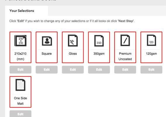
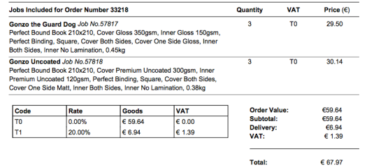
Digital Printing Ireland is the alternative printer that I chose, in order to have a selection of books to choose from. Digital Printing Ireland offer a larger size of 210 x 210mm which really interested me. Below are the selections for the first batch that I ordered from this site, which was the matte finish.

Screen Shot 2016-04-30 at 11.06.15

I then proceeded to do the same process except choosing all gloss options

Screen Shot 2016-04-30 at 11.06.15

I ordered 3 books of each which added up to €67 altogether including delivery, which was a lot better than the blurb cost. I am very excited to see the results.

Screen Shot 2016-05-17 at 18.08.11Screen Shot 2016-05-17 at 18.08.29

Printing with Blurb!

The day finally arrived to set up my book for print with Blurb. I completely underestimated this process as I faced quite a few difficulties along the way. Blurb offer an InDesign set up. Unfortunately, as I designed my document in Adobe Illustrator, I had to bring each page individually into Illustrator and resize it.

A main difficulty that I came across was one that in fact had an easy solution. After bringing two different pages into the InDesign Document, blue outlines were appearing around two objects. I found this extremely unusual as it had never happened me before, and I struggled to find information online about the issue. I eventually discovered that he solution was simply in View – Extras – Hide frame view. This issue took up hours of my time.

The front cover also had to be set up in a separate document.

Screen Shot 2016-04-29 at 14.58.59

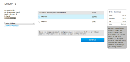
Once the document was set up, the information was supplied and I uploaded it to the website. The books added up to a total of £109 which works out at around €150. I felt that this was a lot of money to pay for three books, but I was very keen on getting the hardbacks made, as it is the way I envisioned the book from the beginning.

Screen Shot 2016-05-17 at 17.48.14

Screen Shot 2016-04-29 at 16.43.37Screen Shot 2016-04-29 at 16.44.46Screen Shot 2016-04-29 at 16.46.01Screen Shot 2016-04-29 at 16.46.07

After uploaded to the site, I was upset to see that the expected date of delivery was in fact the day that my project was due. When I first got a quote, it was made clear that 8 days was the expected turn over time, so I emailed them with regards to this.

A member of their team got back to me quicky enough with this response:

Screen Shot 2016-05-17 at 17.54.09Screen Shot 2016-05-17 at 17.54.29

All I can now do is hope that the blurb books arrive in time.

Spread Addition Continued

The second page is one which shows Gonzo and Ruby sharing a moment where they are laughing and enjoying their company. I wanted to place them on the grass.

Illustrating the second page of the spread:

I began by drawing Gonzo on the grass.

Screen Shot 2016-04-28 at 12.32.55Again, capturing the outline was a tricky process, as I wanted it to flow as well as the one of the previous page does. As the bottom of the first page is white, it meant it was easier to blend out the design, but as this page has green grass at the bottom and a blue sky at the top, I found it trickier to blend it.

With the later incorporation of the scene being set at night time, I then proceeded to add the nights sky in different variations.


After dismissing the idea of the moon, I then proceeded to include stars, which I hoped would add to the night sky.

Screen Shot 2016-05-17 at 16.39.44

Finalised Page 10:

Screen Shot 2016-05-17 at 16.48.19

Finalised Spread:

I am delighted with the finalised spread. I would not of came to this final design without the help of user testing. I tested almost 10 different adults and 6 children within my target audience for this spread. Some of the changes they assisted me with was the inclusion of stars and the removal of the moon.

Screen Shot 2016-04-28 at 13.53.12

Spread Addition

I was advised to add another spread which focuses on the relationship between Ruby and Gonzo as their friendship is a crucial part of the book. She is the reason that Gonzo faces his fears.

At this stage in the process, I felt as though I was out of the story-writing mindset. It had been quite a while since I finished the story and I struggled on coming up with the lines for this spread.

I knew from the outset that I wanted to include a couple of different scenes on a white background, showing Gonzo and Ruby doing different activities.This inspiration came from a page in the book “Norman the slug with the silly shell”, which I have included an image of below. It was just coming up with which activities that was the problem! I really wanted to show Ruby flying, so the idea of them playing fetch was an initial idea, then the notion of the kite came to me one morning. I thought that a kite would be a lovely way of showing Gonzo on the ground and Ruby flying in the air, as well as it being a useful way of incorporating colour.

(Layout of inspirational page in “Norman the slug with the silly shell”)

13234998_10153773081798883_2073259003_o

The Rhyme:

My initial rhyme that I came up with was:

“Gonzo and Ruby play all day long. They love to listen to their favourite song.

The laugh and joke until the day ends, they really are the best of friends.”

I wanted to show Gonzo and Ruby listening to music on the radio but I decided against this as the children would not be able to relate to what song it is that they are listening to.

After thinking of the kite idea, the rhyme changed to this:

“Gonzo and Ruby love to have fun. They play with their kite while out int the sun.

The laugh and joke until the day ends, they really are the BEST of friends.” 

Storyboarding:

I sketched my idea roughly, to use as a basis in Adobe Illustrator.

New Spread Storyboard.jpg

Illustrating the first page of the spread:

I enjoyed drawing the kite the best. I decided on not using the hand drawn outline for the kite as it took away from it. I then placed Ruby on the top of it and gave her an added smile.

The outline:

Drawing the outline in a way that I was happy with took a long amount of time. I would consider myself quite a perfectionist and found it tricky to settle on an outline for the clipping mask.

The Clipping Mask:

The sketch idea was interesting. I really liked the idea of it although I considered it to be substantially different to the spreads in the rest of the book.


The clear blue was another idea of mine. Again, whether or not to put an outline around the image was something I couldn’t decide on.

Finalised page 9:

I was delighted with how this page turned out and I am so happy that I included it. I feel that it makes such a difference! The addition of the sun really adds the spread also as it was a nice experiment where the object is placed over the word of its meaning.

Screen Shot 2016-04-28 at 11.49.27.png


Page 19/20 Changes

This spread is one that I have been struggling with for quite some time. I settled on the idea of the yellow and black lines in the background but I was never really happy with that and always knew I would revisit the page further along.

Change in writing:

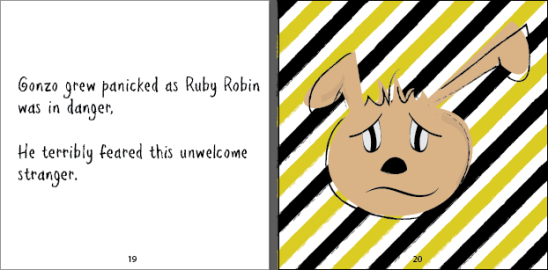
I changed the writing to try and bring the reader into Gonzo’s thoughts. Instead of used “Gonzo grew panicked as Ruby Robin was in danger. He terribly feared this unwelcome stranger.” I decided to go with “OH NO! Ruby Robin is in DANGER! What will I do about this unwelcome stranger?” I feel as though the change in this text completely restructures the spread.

Previous Spread:

Screen Shot 2016-04-11 at 16.36.41

Changes:

I began to draw a typical yellow warning sign.


I then began to experiment with different ways of using this on the page. I decided that I needed to evaluate this, as I felt as though because I was looking at it for so long, it was blurring my vision. I gave the different spreads to my sister, who brought it into her primary school classes. There was mixed views from the children, who did really like the idea of the lines, but I still felt that it was slightly over powering, and didn’t flow well with the rest of the book. After asking several different friends, who I think have a good eye for design, the majority felt the same as me, as though the lines were too over-powering.

Screen Shot 2016-04-26 at 14.38.35Screen Shot 2016-04-26 at 14.46.13

Finalised Spread:

I decided on removing the lines while still keeping the warning sign in. This really helps to stress the point that Ruby is in danger. It is also good for children to learn of the different icons and symbols that represent warning, so I thought that this inclusion made the spread. I like that it is one of the few spreads which supports a completely white background. I find that it really brings the character out of the scene and makes it clear that this is Gonzo’s thought process. I am delighted with the chosen spread.
Screen Shot 2016-04-26 at 14.46.40